|
The new president of New York City's prestigious Archbishop Molloy High School wanted to create a fresh new beginning for the school which was established since 1892. A vital part of this effort was to re-brand the school's image; new logos, artwork, embroidered uniforms, and signage were needed.
|
|
 |
|
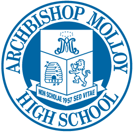
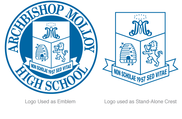
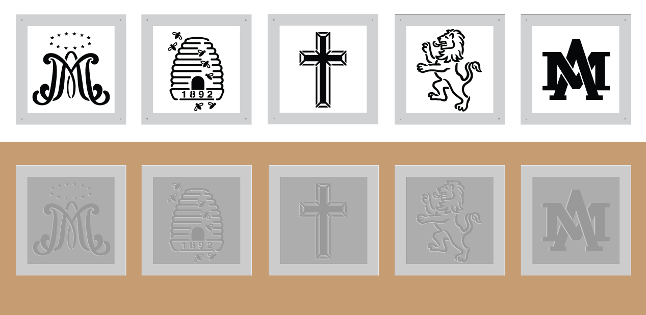
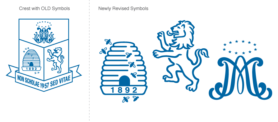
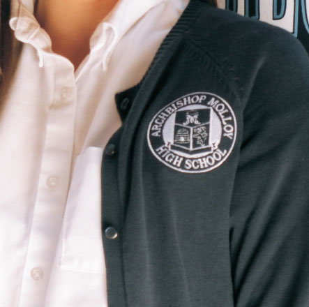
School Crest Logo Re-Designed.
The school's Crest Logo is a locally well-recognized mark. The symbols within the logo were becoming too complex and outdated. Newly designed symbols were needed to be applied onto uniforms, signage, stationery, and many other applications throughout the school.
|
|
 |
|
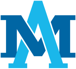
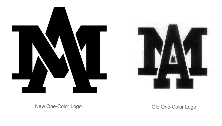
New School Athletic Logo.
Their existing athletic division's symbol was difficult to read and was dated looking. The newly designed logo resolved these problems, while still maintained its original equity.
|
|
|
|
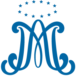
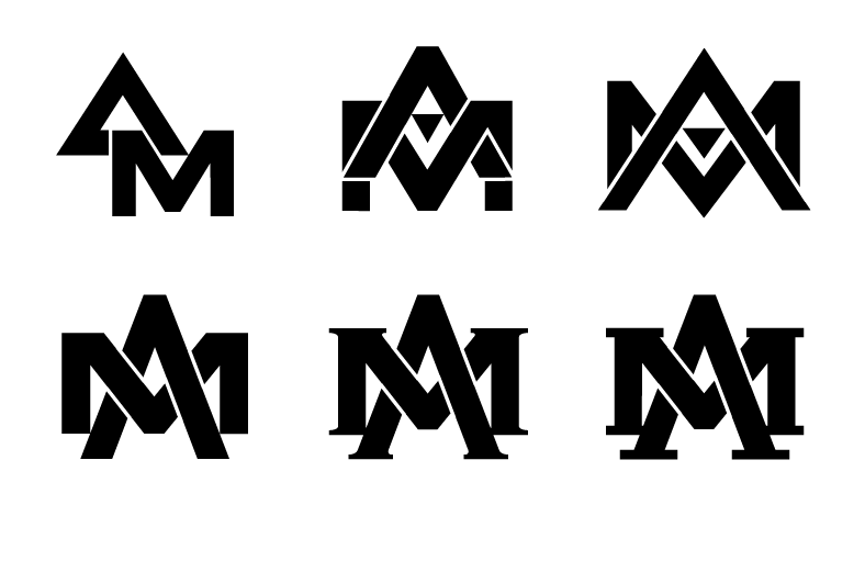
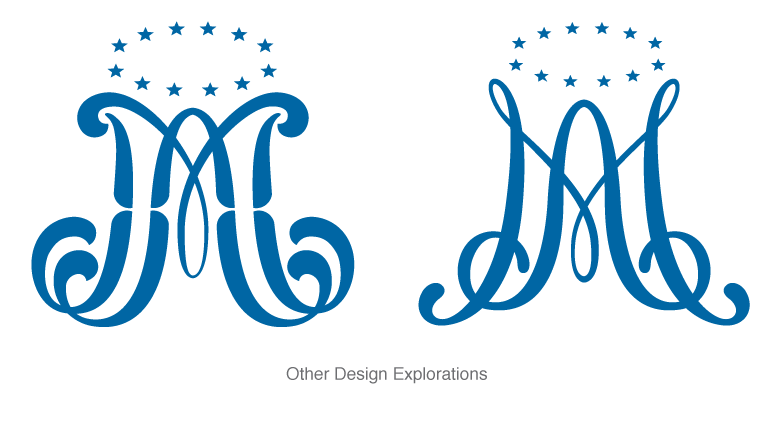
Marist Logo Re-Design.
The Marist Symbol which stands for Ave Maria is an internationally recognized symbol. Many institutions use their own interpretations of the symbol. The original Archbishop Molloy's version was difficult to read. A more modern and simplified version was rendered. Several renditions were explored. Click on image on left to view.
|
|
 |
|
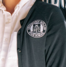
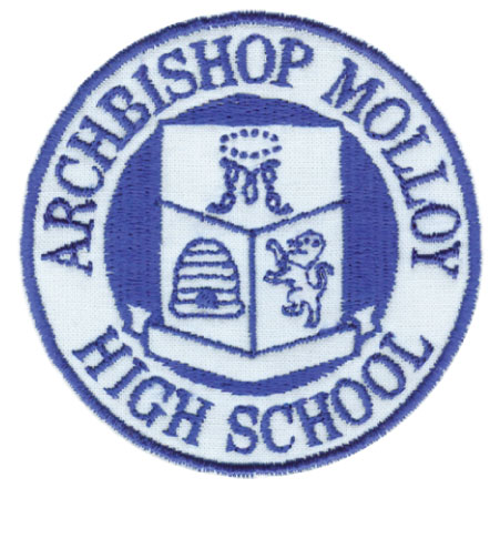
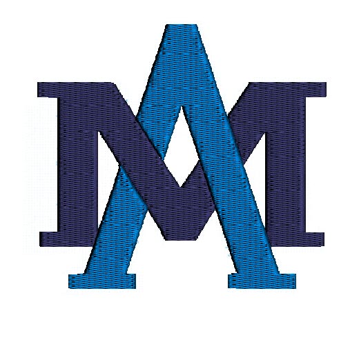
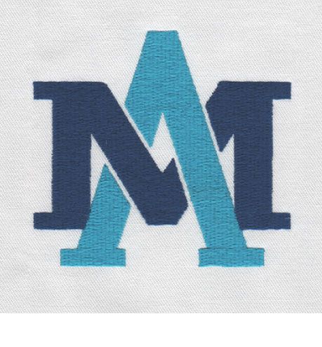
Embroidered Uniforms.
Giving students the option to have new uniforms with an embroidered logo was another effort to improve the school's image. Creating art especially for this purpose was a challenge because the original art was too complicated to embroider well. A series of tests and prototypes were made before the final digitized art was sent to the suppliers for orders of a few thousand pieces.
|
|
 |
|
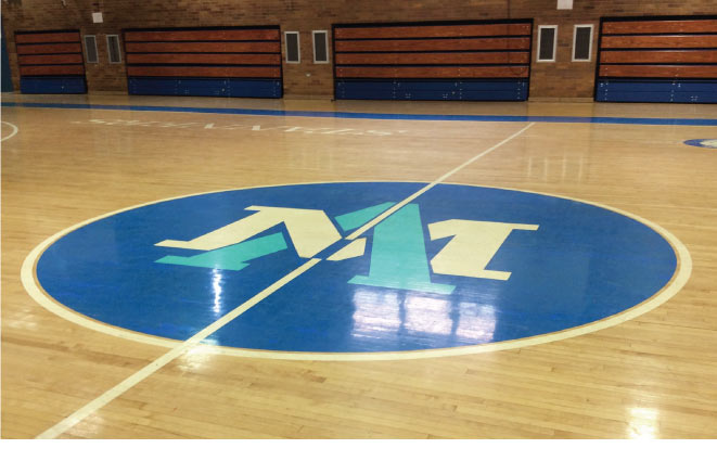
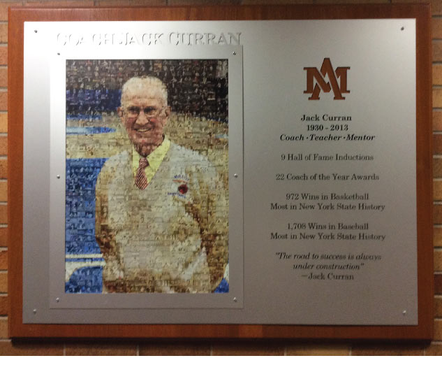
Newly Designed Symbols used for Signage.
The school was undergoing major renovations. The newly designed symbols are used throughout the school. These artwork were rendered for the school cafeteria. Artwork was created to have symbols cut out of metal pieces in 3 layers to give a subtle 3D tone-on-tone effect.
|
|